Informational Posters on 4 famous typographers
As a part of the "Theory of Typography" studio, I was required to conduct a detailed study of any four typographers, observe and analyze their works and finally write an essay and create informational posters about the same. The layout and design of each of the posters is inspired by the works of the respective typographer.
JAN TSCHICHOLD
Jan Tschichold, had a vital role to play in the growth of Typography and Graphic Design in the 20th century. He was also a writer and a teacher. He was greatly influenced in his early years by his father who imparted in him the knowledge of Calligraphy and Lettering. His style of typography in these early years were mainly calligraphic, ornamental and traditional. Until 1923, his focus was on Blackletters and scripts. But attending a Bauhaus exhibition at Weimar in 1924, changed his views totally. He became an advocate of modernism and The New Typography and started expressing his liking for sans-serif fonts and clean layouts and usage of white spaces efficiently through his works. A lot of Modernist typographic rules were set at this period of time which became the icon of this age. Of course, with the rise of Nazis to power and a brief period of arrest where most of his works were seized, something had to change. Tschichold made a shift back to classicism for a bit.
Tschichold’s works includes print designing, books like “Die neue Typographie” (The New Typography) where he upheld the glory of Modernist design, and his famous cover designs of the Penguin Books.
With the few examples of posters designed by him as reference, one can observe that his designs were experimental in the fact that the layouts were diagonal. There is minimalism but with all the essential elements. The titles are bold and clear but are tilted or he has experimented with the sizes and weights of the text. The main title never fails to grab the attention of the viewer. There is also a lot of use of geometric shapes like lines, circles, squares, rectangles, triangles. A consistent feature is the usage of imagery and how it is placed carefully and cleverly in the layout. There is also overlap of various graphical and typographical elements. Another feature that stands out is the minimal, yet effective use of colors that are contrasting, be it for the background or for the text. It seems that asymmetry has played a major role in his designs.
Penguins Books
In the mid-1940s, Tschichold joined the Penguin publishing house in London, and he was responsible for the redesign of the Penguin book covers. Through these designs he setup a standard of Typographic rules.He developed the Penguin Composition Rules – in which he addressed the layout and composition, spelling, grammar and the style. The resulting design, was undoubtedly, timeless. With designated typefaces, he divided the book cover into three rectangular areas – the top for name of the publishing house, the middle region for the title of the book and the author’s name and the bottom region for the instantly recognizable Penguin Logo. One can also observe the vertical typography style for the genre of the books. These designs used Gill Sans used in different styles and it was one of the major typefaces used by him. A clever use of tracking and kerning can also be seen. He also followed a color philosophy in which orange was for fiction, green for crime and blue for biography. There was a good visual hierarchy in these designs and the overall look of the cover was definitely readable. The simplicity and consistency was what made it beautiful.
The diversity of his works and the brilliance with which he created designs in different eras and extremities of Classicism and Modernism and his mastery over the art form of typography has been and will be a gem to explore for designers all across the world.

PAUL RENNER
A landmark in the world of modern graphic design, the typeface Futura, could easily be Paul Renner’s identity. Born in Germany, in 1878, he was brought up with a strict German sense of leadership. Though initially he was known to dislike various elements of modern culture, he greatly admired the aspect of functionality that was an essential feature in Modernism. He is known to have attempted to fuse the gothic and roman typefaces, and is also seen as a bridge between the traditional and the modern design worlds. His masterpiece, the typeface “Futura” has been under study for centuries and still continues to be a piece of awe. The inspiration for him while he was designing future were simple geometric forms. He used that in Futura to denote the movements of progress and development that the world was witnessing in the early 20th century. Renner was a member of the Deutsher Werkbund, the German work federation. He was closely associated with Jan Tschichold and together they played vital roles in questioning and debating the ideologies and art philosophies followed during that time. One can also link the evolution of Germany’s cultural history with Renner’s works over the years.
Futura and its influence
Futura was released in 1927, in Bauer Type Foundry, Germany. The initial drawings made by Renner are shown below. As one can see, the letterforms are highly derived from geometric forms and we can see prevalent appearances of circular, triangular and rectangular shapes in the letters. Though Renner was never really a part of the Bauhaus movement, him being influenced can be seen in this. The letters are devoid of ornamentation, contrast in weights, and are extremely clean and easy to read, which is one of the sole reasons why Futura has succeeded the test of time for centuries now.
The first version of Futura was released in 1927 and over the next 3-4 years an entire family of fonts was developed. It became one of the most widely used and commercially successful typefaces. The radical typeface owes its ingenuity to its functional design and it has been rediscovered and recreated over the years. Futura was also an outstanding indicator of the “New Typography” also known as the Geometrical Modernism, where “Form follows Function” was strictly followed and it is clearly visible in the design of Futura. Because of this, it became a popular choice for display and text composition. It stands for elegance, simplicity, style and clarity. At the same time, it also became the face of “Cultural Bolshevism”. The most famous example of the usage of Futura is it being the official typeface of mission Apollo 11. It was an integral font of choice for multiple brands and companies over the years and still continues to be a part of that legacy.

HERB LUBALIN
Herbert F Lubalin was born in New York in 1918. He is a celebrated American graphic designer and typographer. He is famous for his being an icon in conceptual typography and for introducing expressive typography into print media. He has numerous creations attributed to his name, including the very famous logo for Avant Garde magazine. He was the art director for three Ralph Ginzburg’s magazines: Eros, Fact and Avant Garde. Through these works Lubalin was brilliantly able to showcase his talent of using typography with his work as an art director. He worked on a wide range of projects including poster and magazine design, packaging, logo and typeface design. But his most effective works are what he created for the three magazines he worked as a part of: Eros Magazines (1962-1963), Fact, Avant Garde (1968-1971).
As one can see, Lubalin’s works focuses on designing with letters. His typographic style communicates. It has a message, a story to tell. Lubalin’s forte was being inventive, creative and expressive, and his craft never fails to prove that. Though a couple of his works went on to create controversies, he is still celebrated for the trend he set in the fields of graphic design, type design and its use in advertising. He believed that typography was crucial in creating great ads. Lubalin’s creations use type not just for a name or a title, but to convey emotions, to amplify the meaning of the word, and to evoke a response from the viewers. He used typography to replace imagery, photographs or illustrations. Though in some places we can see him weaving the two carefully and creating a solid graphical piece that remains in memory to this day. In the images shown above, Lubalin’s works for the Post magazine, one can observe how he has diligently placed pictorial denotations of the words with the titles themselves. This huge, block, bold typography along with the witty use of graphical elements, and masterful placement in the article layouts, make it look very catchy and stays in memory for longer than what a normal title would have achieved to do. He also lets the usage of colors speak out. He was playful with words, and by changing the size, weights and spaces of letters, he found a way to change the overall meaning of the pieces. His designs in the three culture-shocking magazines proved his passion for being influential socially and visually. His titles and headlines in the magazines made people stop and engross themselves in the piece and experience the message. Lubalin managed to break rules and create a wave of innovativeness through his work. With Avant Garde logogram, he did just that. He kerned the letters to such an extent where there was almost no space between them. The G and A overlap each other. Through this, it seems that he maybe tried to convey the complexities of emotions that the magazine brought upon with its content. He was also a genius in incorporating visual cues in logotypes. The clever placement of the ampersand within the letter O in his logo design for Mother and Child, to depict a fetus, remains to be one of his best works. Herb Lubalin, without a second thought, is one of the most creative, free-spirted designers this world has ever seen.

NEVILLE BRODY
Neville Brody is a British graphic designer, typographer and art director who is famously known for his works in the Face and Arena magazines and also for his eye-popping album cover designs for multiple musical bands. He studied at the London College of Printing, and it was there that he learnt working experimentally with modernist and post-modernist designs, for which he was criticized. The Punk period took off in the 1970s in London and Neville Brody became one of the iconic designers who was tremendously influenced by this movement, the result of which is seen clearly in his works. Brody experimented with self-made typography which were commonly sans-serif and he was not afraid to mix in a little of Pop art and Dadaistic approaches. His designs attracted music record companies like Fetish Records and Stiff Records, for whom Brody created numerous designs over several years. “The Face” was a British magazine for music, fashion and culture. Brody created some radical fonts and cover designs for this. All his designs, in many ways broke all rules and boundaries that were strictly followed in that period of time in typography and graphic design. Everything just became more artsy and vibrant.
He also created the FUSE project, which is magazine aimed at challenging the norms of visual language and design elements and the usage of media and communication technology. His strength of combining a magazine with typeface design and graphics design was very proficient. He has also designed multiple typefaces which are crazy both in their names and their designs.
Along with these, he also designed TCCC-Unity, a typeface for The Coca Cola Company. It was the first time a brand got a typeface designed specifically for its identity.
Observing Brody’s works, one can find how Brody tactfully illustrated with type. He experimented with size, shapes, alignment and the layout of type. Spatial arrangement and white spaces were used to create uniqueness. In his designs for The Face magazine, one can see the multiple occurrences of covers where the focus is completely on the face of the model and his placement of the title and other content around it was bold and complimenting the face. He did not shy away from using vertical typography, and it is seen repeatedly in most of his designs. He also generously made use of shapes and colors. One can observe that the shapes are indeed very sharp and pointy and his choice of colors seem to communicate emotions. Though most of his graphical outcomes may seem abstract, on deep analysis, it is possible to find the genius behind the choices. His album covers, have a grungy look and they seem to evoke the emotions of eeriness, horror, fear and also a feel of the unknown. And contrastingly in others, he evoked the emotions of the opposite kind too. One can also find a mix of media, handmade and digital. All in all, Neville Brody’s approach to design, his way of liberating the strict rules and pioneering in innovativeness is truly inspiring.

A Journal of Typographic Samples
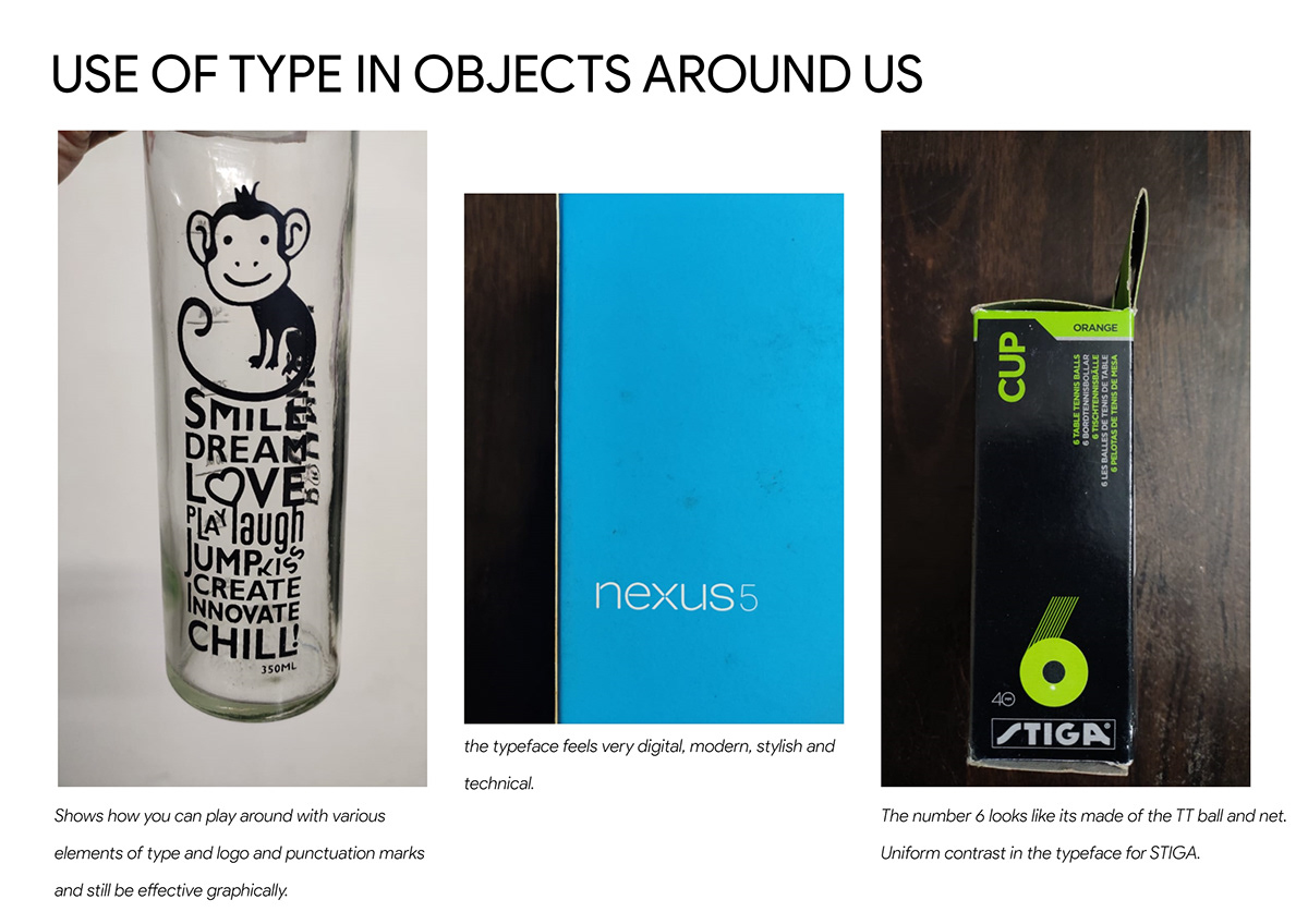
Another interesting activity we pursued was collecting typographic samples from all around us and analyzing the various elements of typography in those.